How to Style a Night Stand
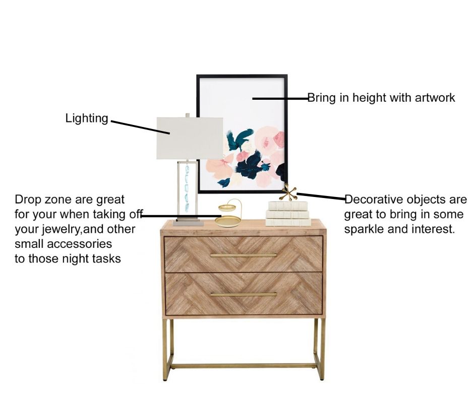
When decorating your room styling the top of furniture pieces like a night stand, console table and even your dresser are important and need to be addressed. Selecting just a few mindful pieces will bring that furniture piece from being boring into looking more put together. Design Steps: How to Style a Nightstand A nightstand may be small, but it plays a big role in your bedroom design. It should be both beautiful and functional — giving you a place for everyday essentials while also adding style and personality to your space. 1. Start with the Right Size Choose a nightstand that works with the height of your bed. Ideally, the top of your nightstand should be about the same height as your mattress, or just slightly higher. This makes it easier to reach for a lamp, book, or glass of water. 2. Add Lighting A table lamp or wall sconce is one of the most important pieces for a nightstand. It adds warmth, creates a cozy glow, and gives you practical lighting for reading or relaxing at night. 3. Keep Everyday Items Close Think about what you actually use before bed. This could be a book, reading glasses, lotion, lip balm, a small dish for jewelry, or a glass of water. Keep these items organized so the nightstand still feels clean and intentional. 4. Add Something Decorative Bring in one or two decorative accents to give your nightstand personality. A small vase, candle, framed photo, decorative box, or greenery can soften the look and make the space feel more styled. 5. Use a Tray or Bowl A small tray, bowl, or dish helps corral smaller items so they do not look cluttered. This is perfect for jewelry, watches, remotes, or nighttime essentials. 6. Create Height and Balance When styling your nightstand, mix different heights. For example, pair a taller lamp with a lower candle, stacked books, or a small decorative object. This helps the design feel layered and balanced. 7. Do Not Overcrowd It Less is more. A nightstand should feel peaceful, not cluttered. Leave a little empty space so it looks clean, calming, and easy to use. 8. Connect It to the Room Your nightstand should flow with the rest of your bedroom. Repeat colors, textures, or finishes already used in the room, such as wood tones, metal finishes, soft linens, or accent colors. This helps create a cohesive, designer-inspired look. A well-styled nightstand should feel practical, pretty, and peaceful — the perfect finishing touch to a beautifully designed bedroom. Shop the look I’ve rounded up some of my favorite decor items I wanted to share with you today. Click on the numbers by each word under the photos and it will go directly to site for your convenience. Note: These may contain affiliates links. I might receive a small commission if you purchase something. Don’t you worry there is no extra cost to you. This helps me keep this blog going. Disclosures & Privacy Policy Nightstand- 1/ 2/ 3/ 4/ 5 Lamps- 1/ 2/ 3/ 4/ 5 Wall Hanging- 1/ 2/ 3 / 4/ 5 Drop Zone- 1/ 2/ 3/ 4 Personal Touch- 1/ 2/ 3/ 4 / 5 Check out these other How to’s Blog post 6 Steps How to design your home How to Create a color Palette for your home Key Aesthetics for a Zen Bedroom Needing help with your home or help selecting the right products for your nightstand, let’s talk about your project! I collaborate with clients throughout the USA all online. By taking your inspiration, I will put together a cohesive design for your space that is tailored to you personal design style and lifestyle. I do all of this within your budget. Want to know more on how E-Design works? Let’s talk! e-design contact me
How to create a color palette for your home

Have you ever found yourself scrolling through Pinterest or Instagram, saving all those beautiful interiors you’re absolutely loving? You notice how every space looks so pulled together, layered, and intentional — and you think, “Wow, I wish my home could look like that.” Well, the good news is… it can. Creating a designer-inspired home is all about building a cohesive look that flows naturally from room to room. It’s not just about making one space, like your living room, look beautiful. The goal is to create a home that feels connected, balanced, and thoughtfully designed throughout. When your colors, textures, furniture styles, and décor choices work together, your entire home begins to feel more polished and complete — almost like you had a designer come in and pull it all together for you. Here are a few simple tips to help you create a more cohesive look throughout your home. Where do you find your color palette Create a color palette. You can get your color palette from: Your favorite color From inspirational pictures. Artwork or area rugs anything that you just need to have in your life structural elements that can’t move Example: kitchen cabinets, flooring and counter tops 1.Favorite colors Do you have a favorite color? Is it a color that would look great in the home? Your favorite color can be spread throughout your home. That would be your great POP of color. For Instance, my favorite color is Blue. I would use that color as my main pop color/ accents. I would add blue in the accent pillow, in the rug and accent pieces. 2.Overall feeling from Inspirational pictures Grab a few pictures from Pinterest and Instagram and create a board. Select anything that catches your eye. Take a look do you see the types of colors and styles you are drawn to? Inspiration pictures can help guide you with your color palette and how your overall style will be. 3. Artwork and Area Rugs Artwork and an area rugs are great ways in coming up with your color palette. Loving an art piece that is in your home or it might be in a store that you have been eyeing all this time? Take a look in the colors being used. Select 1-2 colors out of that piece. You don’t have to use all the colors in the piece just select a few. How to create your color palette 1. Select a neutral select 1 or 2 neutral colors. Neutrals for instance like gray, taupe, tan, brown, cream and black 2. Select a white The white or off white will help coordinate with the neutral colors. The white could be used on the trim, ceiling and doors. 3. Select your pop of color then add 1 shade lighter This is your overall color that will be seen throughout your home. How to use your color palette 1. Main color The neutral will be your main color and overall wall color. Use that main color in different ways throughout your home. This helps coordinates with the neutral. The white could be used on the trim, ceiling and doors. I suggest starting with a neutral sofa. For one main reason if you chose just say a “red sofa” because you liked how it looked at the time or you were following a trend. Then you started not liking this sofa? Will you replace it? If you don’t mind spending money then this would be fine. I suggest investing in a good neutral sofa. You want quality and durability. It’s more affordable to replace throw pillows, artwork and area rugs then keep replacing a sofa. Also, choosing a neutral sofa is easier to coordinate the colors throughout the home. Down the road you have decided that you wanted a change. You already have a neutral canvas already to work with from your neutral sofa and walls. 2. Pop of color The color would be seen on accent walls on pillows and accent chairs. The shade lighter will give you depth . Tip: Colors should be repeated 3 times in the room to help create the cohesive look. 3. Select an accent color The accent color would be the main pop colors complementary color and/or shade lighter of that color. This color will compliment the main color. Inspiration Photo Let’s look at an example. What’s the color palette in this picture? The neutral is white, and black. The pop of color is blue and green and the accent is gold. You will then use these colors throughout your home. Needing help with your home, let’s talk about your project! I collaborate with clients in the throughout the USA all online. By taking your inspiration, I put together a cohesive design for your space that is tailored to you personal design style. I do all of this within your budget. LET’S COLLABORATE Color palette inspiration boards