Have you ever found yourself scrolling through Pinterest or Instagram, saving all those beautiful interiors you’re absolutely loving? You notice how every space looks so pulled together, layered, and intentional — and you think, “Wow, I wish my home could look like that.”
Well, the good news is… it can.
Creating a designer-inspired home is all about building a cohesive look that flows naturally from room to room. It’s not just about making one space, like your living room, look beautiful. The goal is to create a home that feels connected, balanced, and thoughtfully designed throughout.
When your colors, textures, furniture styles, and décor choices work together, your entire home begins to feel more polished and complete — almost like you had a designer come in and pull it all together for you.
Here are a few simple tips to help you create a more cohesive look throughout your home.
Where do you find your color palette
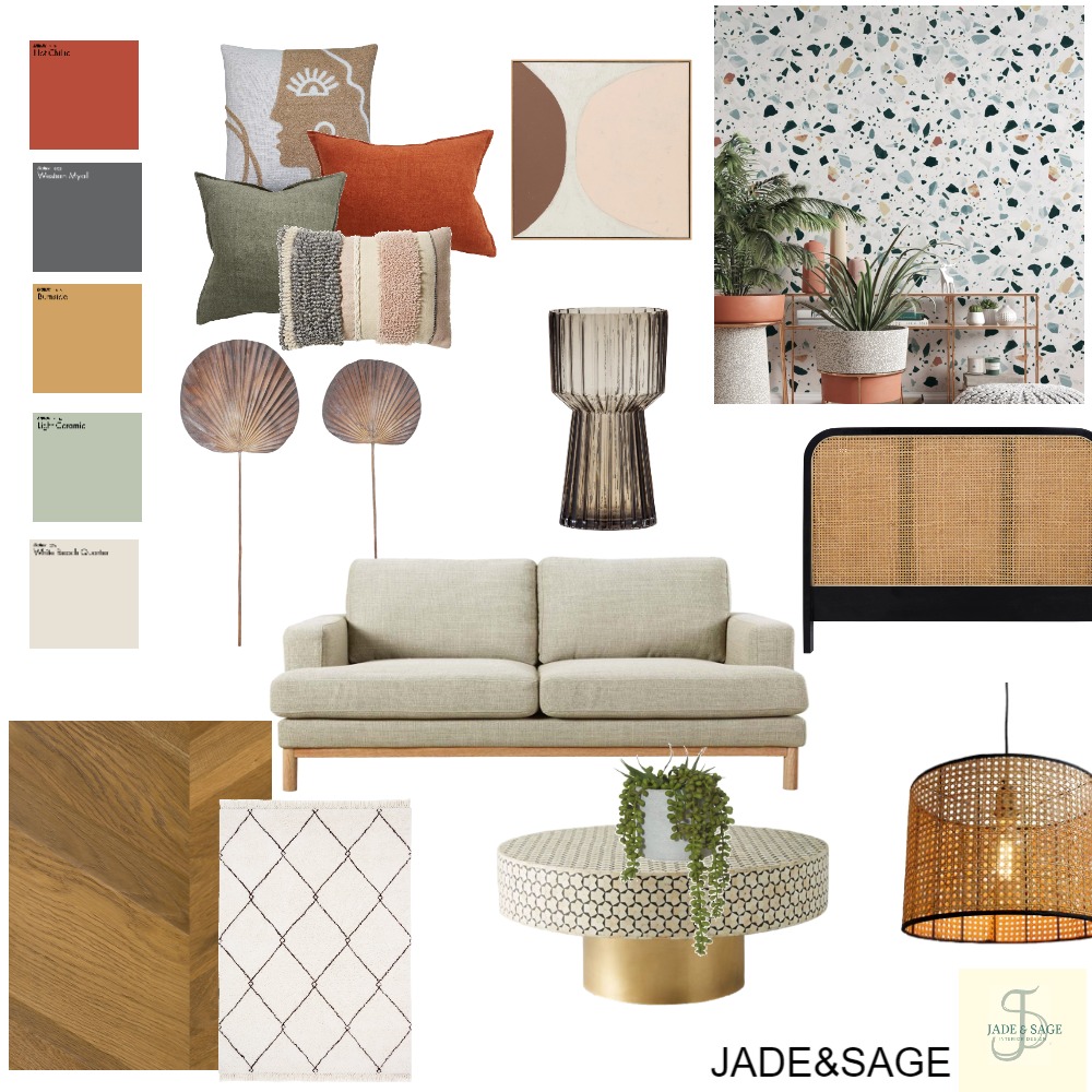
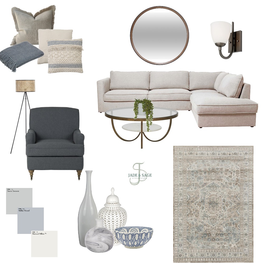
Create a color palette.
You can get your color palette from:
- Your favorite color
- From inspirational pictures.
- Artwork or area rugs anything that you just need to have in your life
- structural elements that can’t move Example: kitchen cabinets, flooring and counter tops
1.Favorite colors
Do you have a favorite color? Is it a color that would look great in the home? Your favorite color can be spread throughout your home. That would be your great POP of color.
For Instance, my favorite color is Blue. I would use that color as my main pop color/ accents. I would add blue in the accent pillow, in the rug and accent pieces.
2.Overall feeling from Inspirational pictures
Grab a few pictures from Pinterest and Instagram and create a board. Select anything that catches your eye. Take a look do you see the types of colors and styles you are drawn to?
Inspiration pictures can help guide you with your color palette and how your overall style will be.
3. Artwork and Area Rugs
Artwork and an area rugs are great ways in coming up with your color palette. Loving an art piece that is in your home or it might be in a store that you have been eyeing all this time? Take a look in the colors being used. Select 1-2 colors out of that piece. You don’t have to use all the colors in the piece just select a few.

How to create your color palette
1. Select a neutral
select 1 or 2 neutral colors. Neutrals for instance like gray, taupe, tan, brown, cream and black
2. Select a white
The white or off white will help coordinate with the neutral colors. The white could be used on the trim, ceiling and doors.
3. Select your pop of color then add 1 shade lighter
This is your overall color that will be seen throughout your home.


How to use your color palette
1. Main color
The neutral will be your main color and overall wall color. Use that main color in different ways throughout your home. This helps coordinates with the neutral. The white could be used on the trim, ceiling and doors.
I suggest starting with a neutral sofa. For one main reason if you chose just say a “red sofa” because you liked how it looked at the time or you were following a trend. Then you started not liking this sofa? Will you replace it? If you don’t mind spending money then this would be fine.
I suggest investing in a good neutral sofa. You want quality and durability. It’s more affordable to replace throw pillows, artwork and area rugs then keep replacing a sofa. Also, choosing a neutral sofa is easier to coordinate the colors throughout the home. Down the road you have decided that you wanted a change. You already have a neutral canvas already to work with from your neutral sofa and walls.
2. Pop of color
The color would be seen on accent walls on pillows and accent chairs. The shade lighter will give you depth .
Tip: Colors should be repeated 3 times in the room to help create the cohesive look.
3. Select an accent color
The accent color would be the main pop colors complementary color and/or shade lighter of that color. This color will compliment the main color.
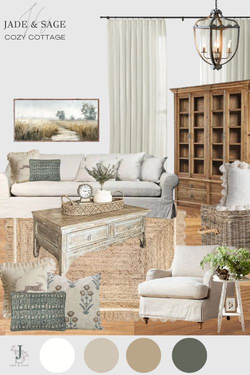
Inspiration Photo
Let’s look at an example. What’s the color palette in this picture? The neutral is white, and black. The pop of color is blue and green and the accent is gold.
You will then use these colors throughout your home.

Needing help with your home, let’s talk about your project! I collaborate with clients in the throughout the USA all online. By taking your inspiration, I put together a cohesive design for your space that is tailored to you personal design style. I do all of this within your budget.
Color palette inspiration boards