DESIGN TIP: FURNITURE ARRANGEMENT & TRAFFIC FLOW
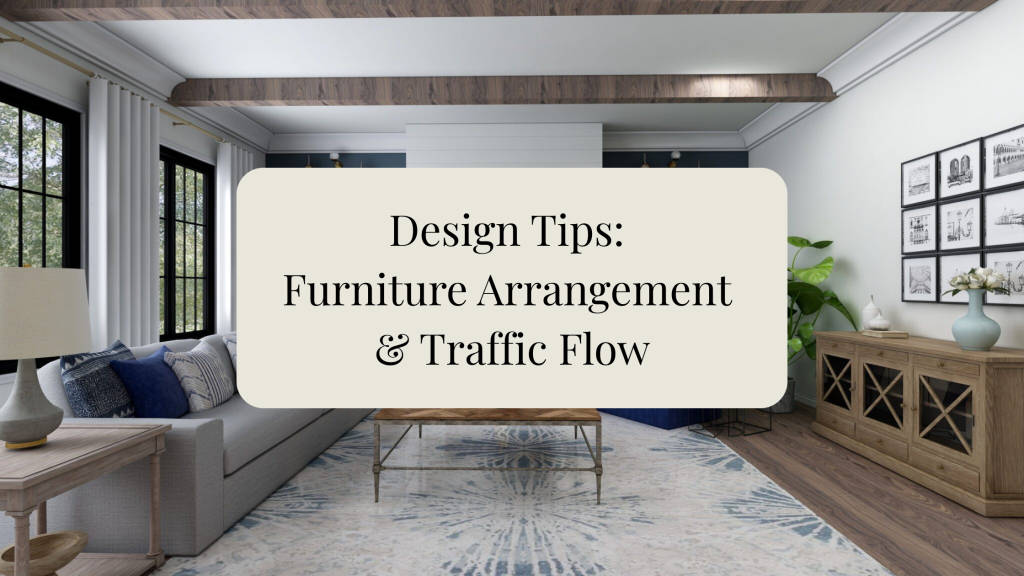
Design Tips: Furniture Arrangement & Traffic Flow A beautiful room is not just about the furniture you choose — it is also about how the room functions. Good furniture placement should feel natural, comfortable, and easy to move through. When a space has proper traffic flow, your home feels more open, organized, and inviting. Start by thinking about how people enter, walk through, and use the room. You want clear walking paths so the space does not feel crowded or awkward. A good rule of thumb is to leave about 30–36 inches of space for main walkways when possible. In tighter spaces, try to keep at least 24 inches minimum so people can still move through comfortably. When arranging furniture, avoid pushing every piece against the wall. Floating your sofa or chairs slightly inward can create a more cozy and intentional seating area. This works especially well in living rooms, open floor plans, and larger spaces where you want the furniture to feel connected. Your seating should encourage conversation. Sofas and chairs should face each other or be angled toward one another, rather than all facing only the TV. A coffee table or ottoman in the center helps anchor the arrangement and gives the room a finished look. Minimum Spacing Tips For a comfortable living room layout, leave about 16–18 inches between the sofa and coffee table. This gives enough room to walk around while still keeping the table close enough to reach. Between chairs or side tables, allow at least 18–24 inches when possible. This keeps the space from feeling cramped and allows people to move easily between pieces. For major traffic paths, such as walking from one room to another, aim for 30–36 inches of clearance. For smaller walkways around furniture, 24 inches can work as a minimum. If you have a dining area, leave at least 36 inches between the dining table and walls or nearby furniture so chairs can pull out comfortably. If there is a main walkway behind the chairs, 42–48 inches is even better. In bedrooms, try to leave at least 24 inches on each side of the bed when space allows. For a more comfortable walkway, 30 inches is ideal. At the foot of the bed, allow 30–36 inches if you have a bench, dresser, or walkway. Also consider the room’s focal point. This could be a fireplace, a window view, a TV, a beautiful piece of art, or even a statement furniture piece. Arrange your main furniture around that focal point so the room feels balanced and purposeful. Be careful not to block doorways, windows, or natural pathways. If someone has to walk around too many obstacles, the room will feel uncomfortable even if the décor is beautiful. Good design should make everyday living easier. Area rugs are also helpful for furniture placement. In a living room, try to have at least the front legs of your sofa and chairs on the rug. This helps define the seating area and makes the room feel pulled together. More info. on Area rug arrangement placement. Read this blog post HERE. The goal is to create a space that looks beautiful, feels comfortable, and functions well for your daily life. A well-arranged room should feel effortless — easy to walk through, easy to sit in, and easy to enjoy. Design Tip: Before buying new furniture, measure your room and map out your walking paths. Sometimes the right arrangement can make your space feel brand new without purchasing anything at all. Check more related blog posts here! Design Tip: Working with Odd numbers in designing HOW TO MAKE A SMALL ROOM FEEL LARGER How to create a color palette for your home 6 Steps How to design your home Need designer help with your space ? Need a designers advice? Check out my E-Design -Virtual Interior Design Services. HERE
HOW TO STYLE YOUR RV HOME TO BE MORE HOMEY
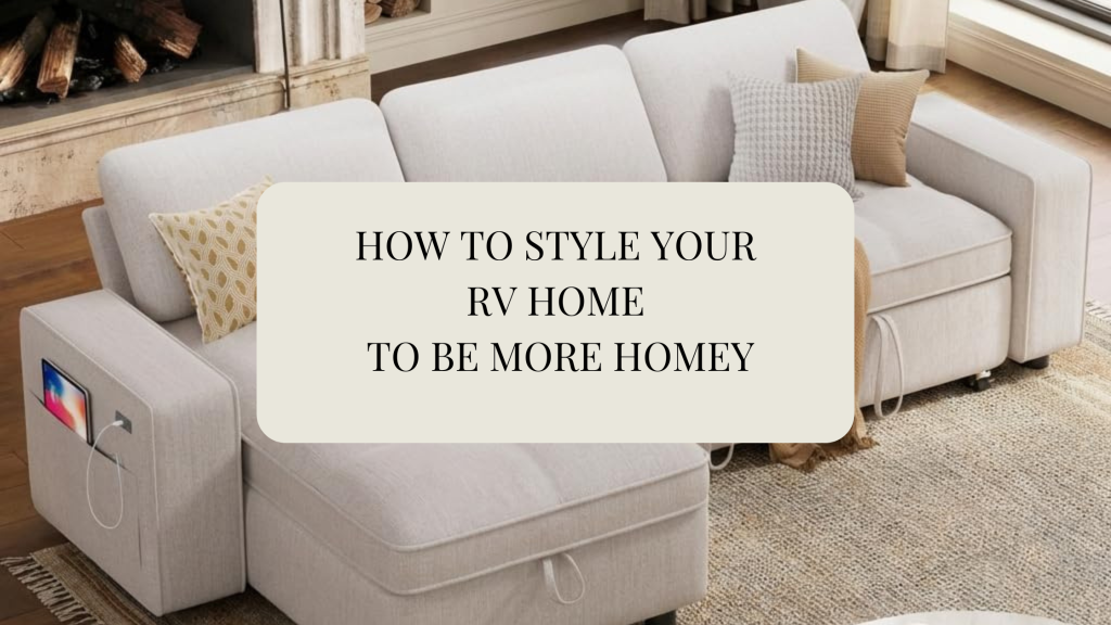
When I was young my family and I used to have a 40 foot Rv and we would travel around in it together. So many wonderful memories. Now that I have my own family we are adventuring out to the RV living world. Exploring and creating memories with my kids. So, stay tuned for when we buy our RV. Were I will make my RV Home to fit my lifestyle and taste. We have explored the RV shows and we do have our favorites. Even though they were very nice, they seemed to showroom / contractor grade look. They need a designer touch. Making it cozy, stylish and functional to your lifestyle. Rv’ing is either a vacation home or a permanent home. You should make it to your taste and style. Way’s in making your RV “Homey”. Soft Textures Layering texture instantly creates comfort. Add: linen-look curtains woven baskets knit throws textured pillows lightweight rugs soft bedding woven shades via: RV Showoff 2. Lighting Factory RV lighting is usually harsh blue-white LEDs. Switching lighting alone can completely change the mood. Do this: warm LEDs (2700K–3000K) dimmable lighting sconces battery puck lights under-cabinet lighting table lamps woven pendant lights (lightweight) Avoid: cool blue lighting overly bright ceiling-only lighting 3. Remove The RV colors Painting old or outdated cabinets with a coat of fresh paint could turn a room looking new. Older RVs especially have: yellow oak shiny espresso cabinets fake granite gray overload via: mountain modernlife 4. Wall Treatments Accessorizing your space will add interest and revealing a more put together look. You can show off your style. Easy upgrades: peel-and-stick wallpaper beadboard wood slats limewash-style paint framed art vintage signs mounted mirrors 4. Change window treatments Factory valances scream “RV.” Removing them modernizes the space immediately. Replace with: linen curtains Roman shades woven wood shades soft neutral drapery bamboo blinds via: rvinspiration 5. CREATE A REAL BEDROOM FEEL Many RV bedrooms feel temporary. Make it feel like a cozy bedroom. Add: layered bedding oversized pillows wall sconces upholstered headboard wallpaper accent wall warm bedside lighting matching bedding palette Biggest upgrade: Use real comforter styling instead of RV “bedspread sets.” 6. WALL TREATMENTS CHANGE EVERYTHING Walls are often what make RVs feel cheap. Easy upgrades: peel-and-stick wallpaper beadboard wood slats limewash-style paint framed art vintage signs mounted mirrors 7. ACCESSORIES The little details matter. Add: ceramic mugs cutting boards cookbooks faux olive branches candle warmers woven trays real-looking greenery antique brass hooks These create lived-in warmth. 8. UPGRADE THE DINETTE AREA Most RV dinettes feel stiff and cafeteria-like. Improve with: café-style seating removable table pedestal upholstered cushions wood tabletop pillows pendant light above table Think: tiny breakfast nook instead of RV booth. via:mountainmodernlife 9. FLOORING MATTERS A LOT One continuous floor throughout the RV makes it feel larger and more upscale. Best choices: warm oak LVP natural wood tones matte finish flooring wider planks Avoid: shiny gray floors busy patterns 10. MAKE THE KITCHEN FEEL CUSTOM RV kitchens often feel plastic-heavy. Easy upgrades: peel-and-stick backsplash matte black faucet brass hardware wood shelves under-cabinet lighting wood countertop covers decorative dish towels Fresh paint or stain cabinet inside accessories 11. MAKE IT FEEL CURATED — NOT CROWDED Small spaces get cluttered quickly. The trick is: fewer items better items Use: intentional décor matching containers hidden storage cohesive materials repeated textures/colors 12. BRING IN NATURAL ELEMENTS Nature softens RV interiors instantly. Great RV-friendly natural elements: faux olive trees eucalyptus stems rattan woven textures wood tones stone-look accessories linen fabrics 13. HIDE RV “UTILITY LOOKS” The more you disguise RV mechanics, the more residential it feels. Hide or soften: fuse panels vents plastic trim exposed wires bulky electronics Using: decorative baskets framed doors custom cabinetry panels hidden charging stations 14. CREATE ZONES Even tiny RVs feel better when visually divided. Zones: sleeping coffee area lounge dining workspace Use: rugs lighting color wall treatments furniture orientation to define spaces. 15. SCENT MATTERS MORE THAN PEOPLE THINK Smell affects perceived comfort massively. Best RV-friendly scent ideas: wax warmers simmer pots soy candles cedar sachets linen sprays 17. THE BIG SECRET What makes RVs feel truly homey is not expensive finishes. It’s: warmth softness lighting texture personality intentional styling comfort People remember how the RV felt emotionally: cozy peaceful inspiring welcoming That’s what separates a styled RV from just a remodeled RV. I’ve curated a few design boards/ shop the looks to help you design your RV Home. Get inspired. Get’s ideas. Find something you like? I’ve included a direct link for you to be able to shop easily. This blog may contain affiliate links. This is at no cost to you. I only recommend products I would buy for myself. Disclosures & Privacy Policy SOFA/ RUG/ PILLOW GREEN/ PILLOW FLORAL/ ARTWORK/ WOOD FLOOR/ SUBWAY TILE/ WALLPAPER SOFA/ PLANT/ RUG/PILLOW/FLORAL PILLOW/ OTTOMAN/ TILE/ GREEN SUBWAY/ WOOD FLOOR SOFA/ RUG/ PENDANT/ BLUE PILLOW/ FLORAL PILLOW/ WALLPAPER/ BLUE TILE/ WOOD FLOOR Are you looking to redesign your RV or Small home? Do you need some help? I would love to help. I can help you create a curated look for your entire home. Need suggestions on storage solutions? Let’s created solutions that help you get organized and stay organized. I’ve helped clients around the USA with my affordable Virtual Interior Design services. Check it out here! Follow me for more Design Tips and Inspiration. Before styling your home on wheels, Check out my previous blog post about – Tips & Guidelines when designing a RV Happy Styling!
Tips & Guidelines when designing a RV
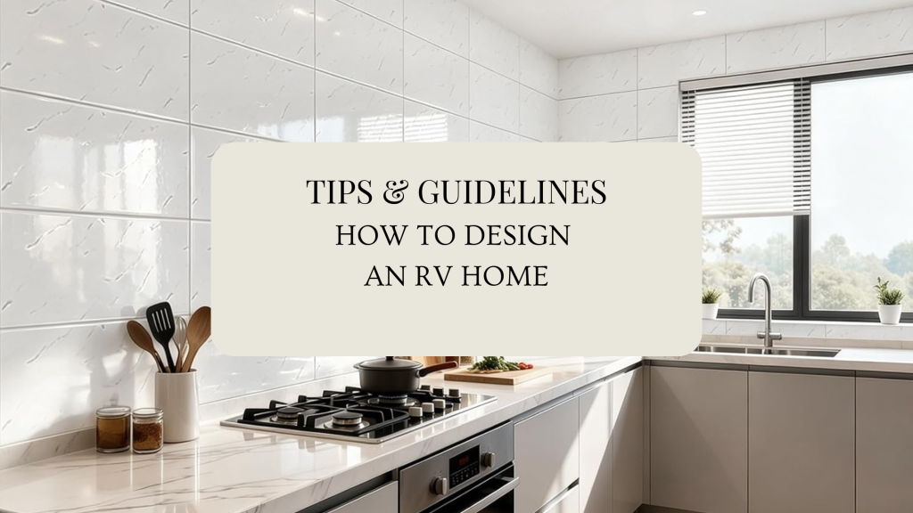
Designing an RV is very different from designing a house because every decision affects: weight movement/vibration moisture storage safety maintenance temperature control livability in tiny spaces Core RV Design Mindset Think of an RV as: “A moving tiny home exposed to humidity and cold temperature swings, and constant vibration.” Everything must be: lighter stronger flexible easy to clean multi-functional This blog contains affiliate links. I might get a small commission, but at no cost to you. Disclosures & Privacy Policy 1. WEIGHT IS EVERYTHING This is one of the biggest mistakes people make. Every material matters Real stone, thick hardwoods, heavy tile, concrete-look slabs, and oversized furniture can destroy: fuel economy towing performance suspension safety Better RV-Friendly Choices Instead of: marble granite solid hardwood everywhere ceramic tile Use: lightweight laminate thin plywood veneer luxury vinyl plank (LVP) peel-and-stick flexible tile lightweight butcher block aluminum framing thermofoil cabinetry via: wanderfulrvinteriors.com 2. FLEXIBILITY & MOVEMENT Homes don’t move. RVs flex constantly. Rigid materials crack. Avoid: brittle grout heavy tile thick plaster poorly secured décor glass-heavy shelving Use: flexible adhesives lightweight trim screw-fastened cabinetry rounded corners soft-close hardware with locking mechanisms Check out this 12 x 24 marble tile. PVC Waterproof Tiles Peel and Stick Wall Panels Self Adhesive Backsplash Tiles for Kitchen Living Rooms TV Walls Bathroom Rv Camper Van (Not Real Tile) HERE 3. MOISTURE CONTROL IS HUGE RVs trap condensation FAST. Cooking, showers, breathing, and humidity create moisture problems. Moisture-prone areas: around windows under mattresses behind seating bathrooms exterior walls Design for airflow: vented storage breathable fabrics slatted bed platforms moisture-resistant wall panels mold-resistant materials Best materials: marine-grade plywood vinyl wallpaper performance fabrics waterproof flooring PVC wall panels in bathrooms via:@revampingcamping 4. SMALL SPACE DESIGN MATTERS MORE THAN LUXURY A beautiful RV that functions poorly becomes miserable quickly. Why not have both. Making your RV a home which is functional and lovely. Need help? I can help create a design just for you. CLICK HERE Focus on: flow paths clearance storage access slide-out functionality seated comfort standing headroom Ask: Can someone cook while another person walks through? Can cabinets open with slides in? Can drawers fully extend? Can the bed be made easily? Is there a place to put phones, shoes, coffee, chargers? Tiny frustrations become huge in RV living. 5. STORAGE IS DESIGN In RVs, storage IS part of the aesthetic. Best RV storage strategies: toe-kick drawers under-dinette storage vertical storage hidden hampers magnetic spice racks overhead cabinets multi-use furniture Think: “Where does every single object live while driving?” As a Kitchen and Bath designer I.ve been introduced to many unique storage solutions. Check out a few of my favorites below. Rev-a- shelf is a very well made product. I’ve used Rev-a-shelf in many kitchen designs. Want to get your storage product list for your space? Contact me! Check out this E-Design Service that would be a great fit for Storage Strategies. HERE Rev-A-Shelf Wood Swing Out Pantry Cabinet Organizer Kit. REV-A-SHELF Wood Base Cabinet Replacement MAXX Drawer System w/Soft-Close Rev-A-Shelf Wood Vanity Sink Cabinet Pullout Organizer 6. CHOOSE RV-FRIENDLY FABRICS Fabric takes abuse in RV life. Avoid: delicate linen blends loose weaves easily stained fabrics heavy upholstery Best choices: marine vinyl performance fabric Crypton fabrics Sunbrella washable slipcovers textured polyester blends Slip cover are easy to clean. 7. LIGHTING CHANGES EVERYTHING RV interiors can feel dark and cramped. Prioritize: layered lighting warm LEDs under-cabinet lighting sconces dimmers reflective surfaces Avoid overly blue lighting. Warm 2700K–3000K lighting makes RVs feel residential and cozy. 8. FLOORING GUIDELINES Flooring in RVs must: flex resist water handle dirt survive temperature swings Best options: Luxury Vinyl Plank (LVP) Most popular and practical. Woven Vinyl Great for modern/coastal RVs. Laminate Only if moisture-resistant. Avoid: heavy tile thick hardwood cheap peel-and-stick flooring via: Pinterest 9. THINK ABOUT TEMPERATURE RVs get: HOT COLD humid drafty Materials expand and contract constantly. Smart choices: thermal curtains insulated shades light-reflective window coverings lighter wall colors rugs for warmth soft materials to reduce echo 10. SECURE EVERYTHING If it isn’t secured: it becomes a projectile. Design with: locking drawers cabinet latches tension rods hidden magnets mounted décor secured furniture 11. ELECTRICAL & POWER PLANNING Modern RV users want: laptops phones Starlink TVs coffee stations gaming remote work setups Design around: outlet placement USB charging inverter access solar capability battery storage hidden cable management I hope you found this blog informative. Want to see more? Sign up for my newsletter. I will share more RV and small home living design ideas and inspirations. Check out this Blog about How to Style your RV Home. HOW TO STYLE YOUR RV HOME TO BE MORE HOMEY SAVE THIS PIN FOR LATER
DESIGN TIP: AREA RUG PLACEMENT
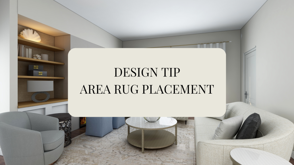
Area rugs are one of the easiest ways to transform a space—but only if they’re placed correctly. The right rug can anchor your furniture, define zones, and bring warmth and balance to your home. Here are simple, designer-approved tips to get it right every time. Your Living Room rug should connect your furniture, not sit awkwardly in the middle. The three golden layouts: All legs on: The most polished look—every piece sits fully on the rug Front legs on: A balanced, everyday designer approach Avoid floating rugs: A small rug centered alone breaks up the room visually Jade & Sage Tip: When in doubt, go bigger. A larger rug makes your space feel more open, not smaller. A Dining Room rug should make your space feel effortless—not frustrating. What to get right: Leave at least 24 inches around your table Chairs should stay on the rug—even when pulled out Match the shape of your rug to your table Jade & Sage Tip: Choose low-pile or flatweave rugs for easy cleaning and smooth chair movement. Stepping onto a soft rug in the morning? That’s a small luxury that changes everything in your bedroom. Best placements: 2/3 under the bed: Starts under the bed and extends outward Full coverage: Bed and nightstands sit fully on the rug Side runners: Perfect for smaller budgets or tighter spaces Jade & Sage Tip: Aim for 18–24 inches of rug on each side of the bed for balance and comfort. Your entryway is your home’s introduction—make it count. Simple rules: Choose a rug that fits the scale (not too small) Leave visible flooring around the edges Layer a doormat for added texture and style Jade & Sage Tip: Go for durable, natural materials that can handle everyday traffic. Final Thoughts If your room feels unfinished, start from the ground up. The right rug, placed the right way, will: Make your space feel larger Bring your furniture together Add warmth and comfort instantly And most importantly—it will make your house feel like home. Love design tips like this?Stay connected with Jade & Sage for more curated home inspiration, styling guides, and shop-worthy finds designed to elevate your everyday living. What to check out next… DESIGN TIP ON ART HANGING DESIGN TIP: WINDOW TREATMENT HANGING Shop Area Rugs RUGS More info. on how we can work together. HERE
SPRUCE UP YOUR SPACE FOR SPRING

Spring is the perfect season for a fresh start and new beginnings. Refresh your home with these simple, affordable tips to create a space that feels renewed, light, and inviting. ( This Affiliate links are included for your shopping convenience. I might get a small commission. No cost to you) Privacy & Disclosure Refresh #1– One quick way is to lighten up your space. Simply add lighter colors and materials into your room. Swap out your heavier materials like velvet and knitted materials for something lighter like linen and cotton instead. You can quickly achieve this is by swapping out throw pillows and throw blankets. Affordable way is by switching out pillow covers. A fresh new look in seconds. Here are a few pillow covers that caught my eye. Needing pillow inserts? Check these out! Pillow Inserts Refresh #2– Second, The temperature outside is getting warmer and pleasant. Air out your home by opening up those windows. If you have dark curtains on your windows? Swap it out for a lighter window treatment like linen, sheer and cotton. Refresh #3– Plants and florals! After getting fresh air into your space bring nature in. Add air filtering plants into your space. Great for the air and for you. Some of these air filtering indoor plants and hard to kill plants are snake plant, rubber plant, spider plant, Peace Lily, English ivy and the Aloe Vera just to name a few. Refresh #4– Fresh Scent. No more autumn candles and Christmas scent of pine. Time to Swap it for a fresh summer vibe scent. A scent of clean cotton, tropical vibes and/ or beach scent. Keeping the air clean, make sure you choose either soy, beeswax or coconut wax. Your lungs will thank you. Check out these great smelling soy Candles. HERE Small, thoughtful updates can completely transform your home—making it feel fresh, light, and airy without breaking the bank. Stay tuned for my next blog post! Love design tips and inspiration? Join my newsletter and never miss a new idea. Have design dilemma? Check out my E-Design Services. HERE
SHOP THE LOOK: ENGLISH COTTAGE
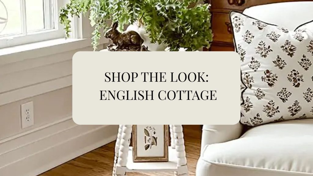
One design style that continually inspires me is English Cottage aka Cottage-core. I’m naturally drawn to spaces that feel organic, rustic, and deeply connected to nature. I love homes layered with vintage finds, historical touches, and natural materials that bring warmth and authenticity into a space. For me, design isn’t about trends—it’s about creating environments that feel grounded, storied, and timeless. Spaces that feel collected over time, filled with character, history, and quiet beauty. 1. What Is English Cottage/ cottage -core? English Cottage is a romanticized aesthetic inspired by: Rural European countryside life Handmade living Slow, intentional rhythms Gardening, baking, sewing, homemaking Vintage charm It’s about simplicity, nostalgia, and natural beauty. 2. Core Design Elements Color Palette Warm cream Soft sage green Dusty rose Muted lavender Butter yellow Faded blue Warm wood tones Materials Natural wood (unfinished or lightly stained) Linen & cotton Wicker & rattan Stoneware & pottery Lace & crochet Dried flowers Textures Floral prints Gingham Ruffles Quilts Distressed finishes To help you visualize the possibilities, I’ve created two curated “Shop the Look” living room designs that you can easily recreate in your own space. click the links to shop SOFA/ ARTWORK/TABLE/ HUTCH/PENDANT/TRUNK/CHAIR/TABLE/RUG/GREENPILLOW/ RABBIT PILLOW/ FLORAL PILLOW/ WHITE PILLOW click the links to shop SOFA / CHAIR / RUG / PENDANT / KNITTED PILLOW / BLUE PILLOW / TABLE / WINDOW PANELS ( This Affiliate links are included for your shopping convenience. I might get a small commission. No cost to you) Privacy & Disclosure Love this style?Sign up for my newsletter and receive weekly inspiration from Jade & Sage. Each week I share Shop the Look designs, step-by-step design guides, and ideas to help you create a home that feels timeless and beautifully curated. When you join, I’ll also send you my FREE e-book: The Designer Room Formula Blueprint, revealing the simple design framework professionals use to create balanced, designer-level rooms.
DESIGN TIP: WINDOW TREATMENT HANGING
Welcome to our third blog on Quick designer tips. Design Tip: Elevate Your Windows with IntentionThis simple guide will help you choose the proper size and placement for your window treatments so your space feels taller, balanced, and thoughtfully designed. On our previous design tip we spoke about Artwork hanging. Check it Here. Also, spoke about working with odd number in decorating. Check it Here. This blog has an affiliate link. Which no cost to you. Disclosure & Privacy DO: Hang Curtains High and Wide Why: Makes ceilings look taller and windows larger. Rule of thumb: Mount rod 4–12 inches above window frame Extend rod 6–12 inches past each side DON’T: Stop Curtains at the Window Frame Kiss the floor = clean, tailored look Slight puddle (1–2 inches) = romantic, old-world, European This visually shrinks the wall and makes the window feel boxed in. DO: Choose Natural Textures Linen Cotton Woven wood Bamboo Soft, muted neutrals DON’T: Overmatch Everything Avoid: Matching curtains to wall color exactly Matching sofa fabric exactly Heavy shiny polyester in a rustic room Window treatments should layer, not disappear. DO: Layer for Depth Beautiful combinations: Sheer + linen panel Roman shade + drapes Bamboo shade + neutral curtains Layering = richness. Ask: Is this for privacy? Light filtering? Blackout for bedroom? Purely decorative? Design must serve purpose first — beauty second. Bonus Designer Tips (Advanced) Since you’re a designer, let’s go a little deeper: If ceilings are low → use vertical stripe texture If windows are small → go wide with panels If room feels cold → use warmer natural fibers If room feels heavy → choose lighter weave fabric Hardware matters — aged brass, matte black, oil-rubbed bronze > cheap chrome thanks for joining in. Stay Tuned for Next Design Tip. Ever needing help with Designing and would love some help putting your room together? Or you have a design question. Check out a my E-Design service The Refresh Get a copy of my De-Clutter your Home E-Book. Sharing tips and tricks on how to organize. HERE
SEE WHAT’S TRENDING 2026 HOME DECOR TRENDS

Every year, the interior design and fashion industries come together to forecast what will define the year ahead. Soon enough, you start seeing the same styles, color palettes, and overall “vibe” everywhere you look. I’ll be honest—I don’t typically chase trends. Especially the ones that feel over-the-top, burn out quickly, and leave you feeling like you need to redesign your home all over again a year later. That cycle can get expensive fast. Instead, I gravitate toward a more classic, timeless approach—one that evolves naturally and continues to feel relevant year after year. That said… I have to admit, I’m really loving the direction this year’s trends are taking. So let’s break it down. The Vibe This Year This year is all about personal expression and nostalgia. Consumers are leaning into spaces that feel comforting, authentic, and grounded. There’s a strong pull toward natural, organic elements—designs that feel lived-in, meaningful, and connected to nature rather than overly styled. via Healthier Homes 1. Natural Elements Are Leading the Way We’re seeing a renewed love for materials like: Real wood and raw textures Medium oak and warm walnut tones Natural stone Organic cotton and linen fabrics These elements bring warmth, depth, and a sense of calm into the home—without feeling trendy or forced. via Healthier Homes A Shift Toward Health & Sustainability Homeowners are also becoming more educated and intentional about what they bring into their spaces—not just for style, but for well-being and environmental impact. This includes: Natural and non-toxic wall treatments Raw and responsibly sourced wood Organic, breathable fabrics Low-VOC paints A greater focus on indoor air quality Design is no longer just about how a space looks—it’s about how it feels to live in it. via Lulu and Georgia 2. Warm Neutrals This year, we’re moving away from stark whites and cool grays and embracing warm, inviting neutrals. Think earthy browns, soft taupes, warm beiges, and gently muted tones. These colors create depth and comfort, making spaces feel cozy, grounded, and timeless rather than sterile or trendy. 3. Curated Maximalism The phrase “more is more” is making a comeback—but with intention. Curated maximalism isn’t about clutter; it’s about thoughtful layering. Every piece has purpose and meaning, whether it’s collected over time, passed down, or simply loved.Expect layered textures, bold yet balanced colors, vintage accents, and personal objects that tell a story. The result is a space that feels rich, expressive, and deeply lived-in—full of nostalgia without feeling overwhelming. 4. Vintage Revival Vintage is back… though truthfully, it never really left. What’s different now is the modern twist. We’re seeing vintage elements thoughtfully mixed with contemporary design to create spaces that feel both fresh and familiar.Caned furniture is returning with cleaner lines and a modern edge. Checkerboard floors, handmade pieces, and richly textured materials are reappearing, adding charm, character, and authenticity to interiors that celebrate craftsmanship and history. These styles are definitely my style. Natural elements, comfort, cozy and mindful curated decor and design. How about you? Check out my e-design services HERE Get you started in decluttering and organizing your home. Download my EBOOK HERE
DESIGN TIP: ART HANGING

Design rule to follow while hanging artwork and mirrors. I’ve seen plenty of times when entering a room that their art is hung way to high. Also, the art piece are to small for the area. I’ve created a quick diagrams of how high to hang art over sofas, beds and mantles. Rule 1- Hang art 57-60″ from floor to center of art/ mirror. You typically want your piece to be at eye level. A standard eye level is approximately at 60″. Rule 2- The size matters in selecting a piece of art. When choosing art above a bed or sofa your artwork or mirror should be 2/3 the size of furniture piece. An example: A 96″ sofa, the ideal art size should be approximately 60 to 75 inches wide, which is about 2/3 of the sofa’s width. Rule 3- If you are using an art collection or creating a gallery wall. Make each art piece spaced out evenly. Minimal distances between art to art is 3- 6 inches apart. Tip: Use tape or paper templates to visualize spacing before committing to hanging the art. This allows for adjustments based on personal preference and the specific area. Well there you have it. How to hang art. With a few easy steps you can hang art successfully. Looking for beautiful unique art pieces check out this wonderful art company with very talented artist. Awesome Art Finds Need help finding the right piece? Need a visual? I can layout a drawing with the exact size, and install guide and art piece to purchase for your space. Contact me! Check out my design service done “Virtually”. DESIGN ADVICE
Awesome Art Finds

While designing your home and creating a complete look don’t forget about your empty spaces on the wall. Great way to add color and texture and perhaps tell a story, add art on your walls. Art in homes enhances the atmosphere by adding character and personal expression, making spaces feel more inviting and reflective of individual tastes. I’ve curated a few Art pieces that I quite like. Check it out! (This website includes affiliates. No cost to you. ) GOING ON NOW! BLACK FRIDAY SALE! HERE use coupon code: EARLY10 to stack an extra 10% to our promotion so that’s 40% off our biggest offer we’ve had yet. Happy shopping! MOUNTAIN BARN BUTTERFLY DIOR VINTAGE ABSTRACT1 ENCHANTED FOREST DARK GARDEN WILDFLOWER SCENE Before ever selecting a piece of art, first you need to know what size to get. Wanting to know more on how to figure out the size you should get and also the right way on hanging wall art. Check out this Blog where I walk you through steps on how to do just that. Design Tip- Art Hanging So many beautiful options to choose from. Need help with finding the right piece. Message me! Check out my E-Design Service Designer Advice. CLICK HERE