
DESIGN TIP: WINDOW TREATMENT HANGING

Welcome to our third blog on Quick designer tips. Design Tip: Elevate Your Windows with IntentionThis simple guide will help you choose the proper size and placement for your window treatments so your space feels taller, balanced, and thoughtfully designed. On our previous design tip we spoke about Artwork hanging. Check it Here. Also, spoke about working with odd number in decorating. Check it Here. This blog has an affiliate link. Which no cost to you. Disclosure & Privacy DO: Hang Curtains High and Wide Why: Makes ceilings look taller and windows larger. Rule of thumb: Mount rod 4–12 inches above window frame Extend rod 6–12 inches past each side DON’T: Stop Curtains at the Window Frame Kiss the floor = clean, tailored look Slight puddle (1–2 inches) = romantic, old-world, European This visually shrinks the wall and makes the window feel boxed in. DO: Choose Natural Textures Linen Cotton Woven wood Bamboo Soft, muted neutrals DON’T: Overmatch Everything Avoid: Matching curtains to wall color exactly Matching sofa fabric exactly Heavy shiny polyester in a rustic room Window treatments should layer, not disappear. DO: Layer for Depth Beautiful combinations: Sheer + linen panel Roman shade + drapes Bamboo shade + neutral curtains Layering = richness. Ask: Is this for privacy? Light filtering? Blackout for bedroom? Purely decorative? Design must serve purpose first — beauty second. Bonus Designer Tips (Advanced) Since you’re a designer, let’s go a little deeper: If ceilings are low → use vertical stripe texture If windows are small → go wide with panels If room feels cold → use warmer natural fibers If room feels heavy → choose lighter weave fabric Hardware matters — aged brass, matte black, oil-rubbed bronze > cheap chrome thanks for joining in. Stay Tuned for Next Design Tip. Ever needing help with Designing and would love some help putting your room together? Or you have a design question. Check out a my E-Design service The Refresh Get a copy of my De-Clutter your Home E-Book. Sharing tips and tricks on how to organize. HERE I created the Jade & Sage Design Tips E-Book to give you simple, practical designer rules for rugs, artwork, curtains, furniture spacing, lighting, color theory, undertones, bedroom design, dining room design, and more. It’s filled with easy tips, measurements, visual examples, and printable worksheets to help you decorate with confidence. Launch Price: $17Regular Price: $24 Perfect for anyone who wants a more beautiful, cozy, and finished home. HERE
SEE WHAT’S TRENDING 2026 HOME DECOR TRENDS

Every year, the interior design and fashion industries come together to forecast what will define the year ahead. Soon enough, you start seeing the same styles, color palettes, and overall “vibe” everywhere you look. I’ll be honest—I don’t typically chase trends. Especially the ones that feel over-the-top, burn out quickly, and leave you feeling like you need to redesign your home all over again a year later. That cycle can get expensive fast. Instead, I gravitate toward a more classic, timeless approach—one that evolves naturally and continues to feel relevant year after year. That said… I have to admit, I’m really loving the direction this year’s trends are taking. So let’s break it down. The Vibe This Year This year is all about personal expression and nostalgia. Consumers are leaning into spaces that feel comforting, authentic, and grounded. There’s a strong pull toward natural, organic elements—designs that feel lived-in, meaningful, and connected to nature rather than overly styled. via Healthier Homes 1. Natural Elements Are Leading the Way We’re seeing a renewed love for materials like: Real wood and raw textures Medium oak and warm walnut tones Natural stone Organic cotton and linen fabrics These elements bring warmth, depth, and a sense of calm into the home—without feeling trendy or forced. via Healthier Homes A Shift Toward Health & Sustainability Homeowners are also becoming more educated and intentional about what they bring into their spaces—not just for style, but for well-being and environmental impact. This includes: Natural and non-toxic wall treatments Raw and responsibly sourced wood Organic, breathable fabrics Low-VOC paints A greater focus on indoor air quality Design is no longer just about how a space looks—it’s about how it feels to live in it. via Lulu and Georgia 2. Warm Neutrals This year, we’re moving away from stark whites and cool grays and embracing warm, inviting neutrals. Think earthy browns, soft taupes, warm beiges, and gently muted tones. These colors create depth and comfort, making spaces feel cozy, grounded, and timeless rather than sterile or trendy. 3. Curated Maximalism The phrase “more is more” is making a comeback—but with intention. Curated maximalism isn’t about clutter; it’s about thoughtful layering. Every piece has purpose and meaning, whether it’s collected over time, passed down, or simply loved.Expect layered textures, bold yet balanced colors, vintage accents, and personal objects that tell a story. The result is a space that feels rich, expressive, and deeply lived-in—full of nostalgia without feeling overwhelming. 4. Vintage Revival Vintage is back… though truthfully, it never really left. What’s different now is the modern twist. We’re seeing vintage elements thoughtfully mixed with contemporary design to create spaces that feel both fresh and familiar.Caned furniture is returning with cleaner lines and a modern edge. Checkerboard floors, handmade pieces, and richly textured materials are reappearing, adding charm, character, and authenticity to interiors that celebrate craftsmanship and history. These styles are definitely my style. Natural elements, comfort, cozy and mindful curated decor and design. How about you? Check out my e-design services HERE Get you started in decluttering and organizing your home. Download my EBOOK HERE
DESIGN TIP: ART HANGING

Design rule to follow while hanging artwork and mirrors. I’ve seen plenty of times when entering a room that their art is hung way to high. Also, the art piece are to small for the area. I’ve created a quick diagrams of how high to hang art over sofas, beds and mantles. Rule 1- Hang art 57-60″ from floor to center of art/ mirror. You typically want your piece to be at eye level. A standard eye level is approximately at 60″. Rule 2- The size matters in selecting a piece of art. When choosing art above a bed or sofa your artwork or mirror should be 2/3 the size of furniture piece. An example: A 96″ sofa, the ideal art size should be approximately 60 to 75 inches wide, which is about 2/3 of the sofa’s width. Rule 3- If you are using an art collection or creating a gallery wall. Make each art piece spaced out evenly. Minimal distances between art to art is 3- 6 inches apart. Tip: Use tape or paper templates to visualize spacing before committing to hanging the art. This allows for adjustments based on personal preference and the specific area. Well there you have it. How to hang art. With a few easy steps you can hang art successfully. Looking for beautiful unique art pieces check out this wonderful art company with very talented artist. Awesome Art Finds Need help finding the right piece? Need a visual? I can layout a drawing with the exact size, and install guide and art piece to purchase for your space. Contact me! Check out my design service done “Virtually”. DESIGN ADVICE I created the Jade & Sage Design Tips E-Book to give you simple, practical designer rules for rugs, artwork, curtains, furniture spacing, lighting, color theory, undertones, bedroom design, dining room design, and more. It’s filled with easy tips, measurements, visual examples, and printable worksheets to help you decorate with confidence. Launch Price: $17Regular Price: $24 Perfect for anyone who wants a more beautiful, cozy, and finished home. HERE
Awesome Art Finds

While designing your home and creating a complete look don’t forget about your empty spaces on the wall. Great way to add color and texture and perhaps tell a story, add art on your walls. Art in homes enhances the atmosphere by adding character and personal expression, making spaces feel more inviting and reflective of individual tastes. I’ve curated a few Art pieces that I quite like. Check it out! (This website includes affiliates. No cost to you. ) GOING ON NOW! BLACK FRIDAY SALE! HERE use coupon code: EARLY10 to stack an extra 10% to our promotion so that’s 40% off our biggest offer we’ve had yet. Happy shopping! MOUNTAIN BARN BUTTERFLY DIOR VINTAGE ABSTRACT1 ENCHANTED FOREST DARK GARDEN WILDFLOWER SCENE Before ever selecting a piece of art, first you need to know what size to get. Wanting to know more on how to figure out the size you should get and also the right way on hanging wall art. Check out this Blog where I walk you through steps on how to do just that. Design Tip- Art Hanging So many beautiful options to choose from. Need help with finding the right piece. Message me! Check out my E-Design Service Designer Advice. CLICK HERE
Design Tip: Working with Odd numbers in designing

When designing your home and your trying to create a complete finished look. One very important rule to follow is work with odd numbers. Create on fireplace mantles, tables, console table and night stands with the rule of odd number room. Here are a few reasons on why its important and how to apply it to your decorating. 1. Understand the Rule of Three Odd numbers—especially 3, 5, or 7—tend to look more natural and visually interesting. Our eyes move more dynamically over an odd-numbered grouping. It avoids the overly balanced, sometimes “stiff” look that even numbers can create. 2. Create a Visual Triangle When styling three items, arrange them so they form a triangle. This adds height variation and makes the grouping feel intentional. How to do it: Use one taller object (lamp, vase, sculpture) Add one medium-height object (small plant, candle holder) Add one low or wide object (tray, book stack, bowl) This creates a balanced yet organic feel. 3. Mix Heights, Shapes, and Textures Odd groupings work best when each item offers something different: Height: tall + medium + short Shape: round + angular + organic Texture: smooth + rough + woven This contrast prevents the group from feeling repetitive or cluttered. 4. Keep a Common Thread Variety is key—but the group should still relate. Tie objects together using at least one shared element, such as: Color palette Material (wood, ceramic, metal, glass) Style (rustic, modern, coastal) This creates unity without uniformity. 5. Use an Anchor A tray, book stack, or cutting board (for kitchen styling) helps: Contain the grouping Make it feel cohesive Add another layer of visual interest This works especially well for coffee tables, consoles, and kitchen counters. 6. Apply the “Small, Medium, Large” Formula This simple formula makes any odd-number grouping look styled, not random: Large: the anchor or focal point Medium: the supporting piece Small: the accent or detail This ensures flow and hierarchy. 7. Scale Matters Use odd groupings relative to the space: Small surfaces (nightstands, side tables): 3 items Medium surfaces (dressers, consoles): 3 or 5 items Large areas (mantels, shelves, dining tables): 5 or 7 items The bigger the surface, the more objects you can use without looking cluttered. 8. Step Back and Edit With odd-number groupings, less can still be more. After styling: Step back a few feet Check for visual balance Remove anything that feels unnecessary Your eye will naturally tell you if something looks off. If you want, I can also create a visual guide. Check out my Virtual Design services. HERE
CHARMING RUSTIC CHRISTMAS DECOR ROUND UP

This week’s curated look embraces a charming rustic-country aesthetic, grounded in a soft natural palette and enriched with time-worn, earthy materials that bring warmth and character to any space. This curated look comes from one of my favorite online shop Antique Farmhouse. Check them out! HERE ( This Affiliate links are included for your shopping convenience. I might get a small commission. No cost to you) Iron Bells on Rope Hanger Nativity Set Glass Bead Garland Bell Cloche On Round Wood Base Footed Wood Gingerbread Riser Flameless LED Candles With Star Hanger Set of 6 Flameless LED Candles With Star Hanger Set of 6 Embossed Glass Ornament Garland Let Heaven And Nature Sing Canvas Wall Art PIN IT
FALL DECOR -ADD NATURAL ELEMENTS
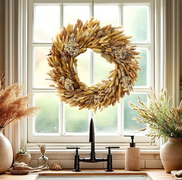
Fall is just round the corner. Decorating for the season is quite fun. I wanted to share with you what I do for fall. If you want something a little different instead of that typical decoration of scarecrows and cute throw pillows, how about adding natural elements into your decor. You can add Autumn pieces like wreaths with leaves and wheat, assorted of acorns and vibrant colored leaves and festive pumpkins. These wood acorns would be great addition by styling them in a decorative bowl, nestle them among garlands, or scatter them across your harvest table for an elegant fall accent. Another way to add natural elements is this hops and foliage garland. It’s perfect for draping across mantels and staircases. We can’t forget about pumpkins. The number 1 fall element next to colorful foliage. Add pumpkins that have different heights and textures, this is a great way to add height, texture and depth. These are great ways in adding natural elements. Bringing nature inside is great way to explore texture and colors. It gives a cozy and warm feeling in your space. Tip: while taking your walk, and you are noticing the leaves are changing and you see acorns scattered along your path. Collect some of those natural items and bring them into your home and use them as your Autumn decor around your house. Happy Decorating. Stay tuned for more quick decorating tips and inspirations. Head on over to our boutique. We make non toxic soy candles, tea towels, throw pillows and artwork.
HOW TO MAKE A SMALL ROOM FEEL LARGER
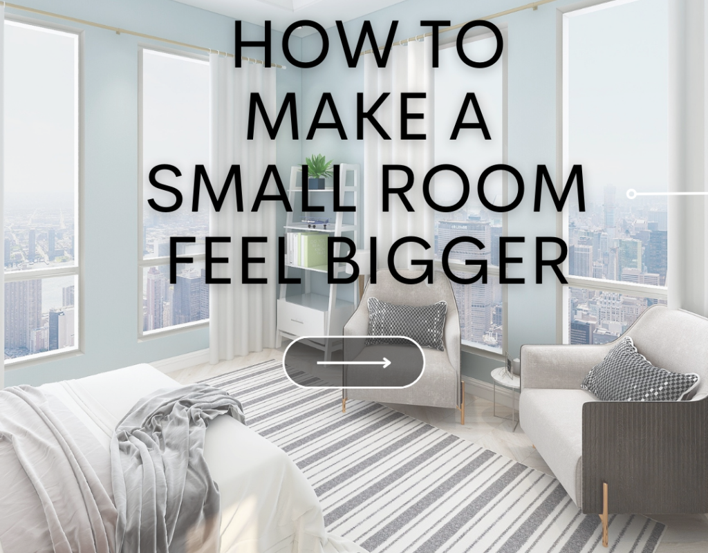
Designing a small space can be challenging, but not impossible. Here are some quick tips to think about while designing your small space. By implementing these steps will help create a small room look more complete and less cluttered look. Your room will seem to look larger. DECLUTTER Keep space clear of clutter, clear up the pathway for easy navigating through the room. This will keep the space more tidy. LIGHT COLORS Choose paint colors that are soft and light shade will reflect light. This gives the space a more bright and airy feel. Light weight window treatments to bring natural light in. FURNITURE ARRANGEMENT Choose furniture that have multi purpose. Try using storage piece for a multi purpose like a storage ottoman or sofa bed. Small space doesn’t mean a lot of small furniture pieces. Select furniture that are big enough, but also that allows for easy movement and flow. Installing pieces that are vertical like shelving on walls or tall built-ins. This will allow the eye to look upward. REFLECTIVE SURFACE Add a reflective piece like a mirror or translucent piece of furniture. This will help create an illusion that the space is bigger and give the room a cluttered and heavy feel of the space. Enjoy learning some quick Design tips and inspirations? Sign up for our newsletter .
3 WAYS TO STYLE YOUR ENTRYWAY
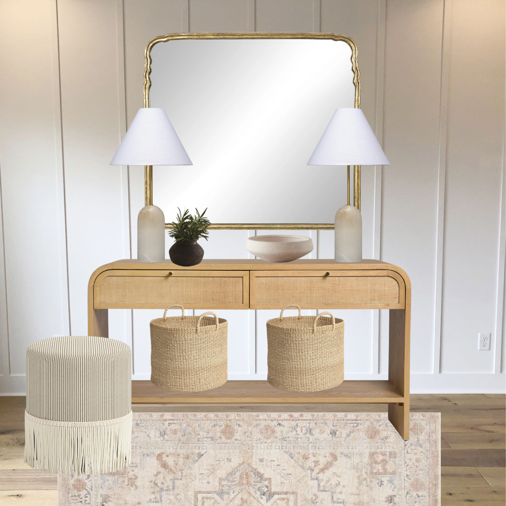
A Entryway is the first area you see when entering your home. Your entryway should feel welcoming and lack of clutter. This space is another opportunity to be creative and express your style. Here a quick tips on how to style your entryway. When styling your entry think about color, functionality, personal style and lighting. This blog contains affiliate links. I might get a space commission There is no cost to you. 1. WALL DETAIL Firstly, add a mirror or artwork for style and color. By adding a mirror or artwork, this will create a focal point within the space and anchor the other pieces together. SOURCE 2. Functional pieces Secondly, I believe the space should have functionality. Design with functional pieces, like console tables or credenza. Pieces that create extra storage and dropping zone for keys, mail and wallet. Put a decorative bowl or box to catch those items. Don’t want to walk into a dark home, add a lamp to switch on. Add Hooks for hanging, and baskets are great addition to store shoes. Lastly, add a bench or ottoman for a place to rest or put on shoes. SOURCE 3. floor Flooring also need to be addressed. Flooring would add style and interest. Area rugs would add warmth. Decorative tile would also be a great addition. SOURCE When designing this space ask yourself how do I need this space to function? Do you need extra storage? Do you need somewhere to hang your jackets or store your shoes? Once you know what you need then ask about style. The space should coordinate with the rest of your home. Want to know how? Check Out this blog! How to create a color palette for your home and 6 Steps how to design your home PIN FOR LATER
Key Aesthetics for a Zen Bedroom
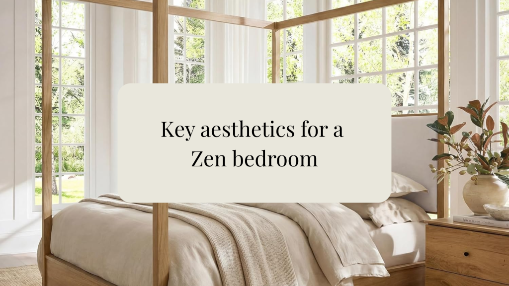
One room I feel we often overlook is the bedroom, but it is one of the most important spaces in the home. It is where we rest, recharge, and spend a large portion of our time. Because of that, your bedroom should feel calm, peaceful, and comforting. A cluttered space can make it harder to truly relax, but when your bedroom is clean, organized, and thoughtfully designed, it creates a sense of peace the moment you walk in. Soft colors, cozy textures, simple décor, and a clutter-free layout can all help create that Zen appeal — turning your bedroom into a restful retreat you actually look forward to spending time in. “Your bedroom should not just be where you sleep — it should be where you breathe, reset, and feel at peace.” BED/CHAIR/DRESSER/RUG/WALLPAPER/NIGHTSTAND/ARTWORK/BEDSHEETS/JADE PLANT/STORAGE BOXES/ PILLOW/ GREEN PILLOW/ BLUE PILLOW For a bedroom to feel calm, peaceful, and Zen, the overall design should feel simple, soft, natural, and uncluttered. The goal is to create a space that helps your body relax the moment you walk in. Key aesthetics for a Zen bedroom: 1. Soft neutral colorsUse warm whites, beige, taupe, soft gray, muted greens, clay, or light wood tones. Avoid harsh bright colors that feel too energetic. 2. Natural materialsBring in wood, linen, cotton, rattan, bamboo, stone, clay, and woven textures. These make the room feel grounded and organic. 3. Minimal clutterA Zen bedroom should feel open and breathable. Keep nightstands simple, hide cords, use closed storage, and only display items that feel calming or meaningful. 4. Soft layered beddingUse breathable bedding with a relaxed look: linen duvet, cotton sheets, soft throw blanket, and a few simple pillows. Think cozy, not overdone. 5. Gentle lightingAvoid harsh overhead lighting. Use warm lamps, sconces, candles, or dimmable lighting to create a soft evening glow. 6. Balanced furniture layoutKeep the room easy to move through. A centered bed, matching or balanced nightstands, and clear walkways help the room feel calm and intentional. 7. Nature-inspired decorAdd plants, simple branches, landscape art, pottery, or a small water-inspired element. Nature helps create that peaceful retreat feeling. 8. Quiet textures instead of busy patternsUse texture for interest rather than loud prints. Think woven baskets, linen curtains, boucle, wood grain, or a soft area rug. “A Zen bedroom is all about creating a peaceful retreat through soft neutral colors, natural materials, gentle lighting, and minimal clutter. The design should feel calm, balanced, and intentional, allowing the space to feel restful, grounded, and inviting.” BED/CHAIR/DRESSER/RUG/WINDOW TREATMENT /BEDSHEETS/JADE PLANT/STORAGE BOWL/ PILLOW/ BLUE PILLOW This blog contains affiliate links. there is no cost to you. I might receive a small commission if you like something you see and purchase it. Note: I only share products that I would as a designer use for myself and select for my client. Your considering redoing your bedroom? Your confused on how to design the room and how to style it to complete that look you’ve been eyeing for so long? I would love to help. I offer a wonderful and easy service called E-Design. CLICK HERE to find out more. Have questions about my E-Design (Virtual Design) service? Message me. Click here