DESIGN TIP: WINDOW TREATMENT HANGING

Welcome to our third blog on Quick designer tips. Design Tip: Elevate Your Windows with IntentionThis simple guide will help you choose the proper size and placement for your window treatments so your space feels taller, balanced, and thoughtfully designed. On our previous design tip we spoke about Artwork hanging. Check it Here. Also, spoke about working with odd number in decorating. Check it Here. This blog has an affiliate link. Which no cost to you. Disclosure & Privacy DO: Hang Curtains High and Wide Why: Makes ceilings look taller and windows larger. Rule of thumb: Mount rod 4–12 inches above window frame Extend rod 6–12 inches past each side DON’T: Stop Curtains at the Window Frame Kiss the floor = clean, tailored look Slight puddle (1–2 inches) = romantic, old-world, European This visually shrinks the wall and makes the window feel boxed in. DO: Choose Natural Textures Linen Cotton Woven wood Bamboo Soft, muted neutrals DON’T: Overmatch Everything Avoid: Matching curtains to wall color exactly Matching sofa fabric exactly Heavy shiny polyester in a rustic room Window treatments should layer, not disappear. DO: Layer for Depth Beautiful combinations: Sheer + linen panel Roman shade + drapes Bamboo shade + neutral curtains Layering = richness. Ask: Is this for privacy? Light filtering? Blackout for bedroom? Purely decorative? Design must serve purpose first — beauty second. Bonus Designer Tips (Advanced) Since you’re a designer, let’s go a little deeper: If ceilings are low → use vertical stripe texture If windows are small → go wide with panels If room feels cold → use warmer natural fibers If room feels heavy → choose lighter weave fabric Hardware matters — aged brass, matte black, oil-rubbed bronze > cheap chrome thanks for joining in. Stay Tuned for Next Design Tip. Ever needing help with Designing and would love some help putting your room together? Or you have a design question. Check out a my E-Design service The Refresh Get a copy of my De-Clutter your Home E-Book. Sharing tips and tricks on how to organize. HERE
Awesome Art Finds

While designing your home and creating a complete look don’t forget about your empty spaces on the wall. Great way to add color and texture and perhaps tell a story, add art on your walls. Art in homes enhances the atmosphere by adding character and personal expression, making spaces feel more inviting and reflective of individual tastes. I’ve curated a few Art pieces that I quite like. Check it out! (This website includes affiliates. No cost to you. ) GOING ON NOW! BLACK FRIDAY SALE! HERE use coupon code: EARLY10 to stack an extra 10% to our promotion so that’s 40% off our biggest offer we’ve had yet. Happy shopping! MOUNTAIN BARN BUTTERFLY DIOR VINTAGE ABSTRACT1 ENCHANTED FOREST DARK GARDEN WILDFLOWER SCENE Before ever selecting a piece of art, first you need to know what size to get. Wanting to know more on how to figure out the size you should get and also the right way on hanging wall art. Check out this Blog where I walk you through steps on how to do just that. Design Tip- Art Hanging So many beautiful options to choose from. Need help with finding the right piece. Message me! Check out my E-Design Service Designer Advice. CLICK HERE
Fall Home Décor

It’s getting cooler out, well not here in Florida, but when living in New Jersey I remember the coolness in the air by now. I don’t miss the cold though. lol I do love the colors in the leaves changing and apple picking. The fall smells are amazing for instance in the spiciness and earthiness of fall candles and the flavors in the delights like of pumpkin spice, and apple pie. I really enjoy changing up my décor for the seasons. Don’t you? I’m always looking for unique décor items for my clients. Here are a few fall décor items that are I believe a must have for your home. My go to stores you have got to check out. These stores are amazing and affordable décor options with you in mind. I absolutely love their products. Come take a look! Love the Farmhouse style? Antique Farm House and Décor Steals specializes in that style. Antique Farm House Decor Steals (This blog contains affiliate links. Which may give me a small commission of any purchases. There is no extra cost to you. This helps me to keep this blog going. Which I love.) word Art Acorn bowls 2a.Lid Jars Hello Fall Art Table Runner Autumn wreath Cozy Blanket Pumpkins Floral Mug set Autumn leaves pillow Candle sticks Pillow The simplest way to change out from season to season is by considering switching out your pillows, throw blanket and table setting. That will miraculously create a different look and you’ll be ready for fall. If wanting to take a step further, change out also your window treatments with earthy and richer color tones in a heavier fabric and match it with a coordinating color area rug to finish up the look. This for sure will give you a more dramatic feeling from summer décor into fall décor. Which ever way you decide, you can’t go wrong. Have fun with it and enjoy the fall season because it seem it leaves us so fast and then here comes Christmas. I do looove Christmas! Oh boy! lol! Time flies I swear! Stay tuned for the Christmas decorating. Happy Decorating! Working on a design project? Need some help? I would love to help. Let’s collaborate on your next project. I offer an amazing and time saving service called E-Design. Want to know more? Check it out! What is E-Design! Click Here
How To’s/ Tips on how to style a Shelf

Styling shelving can feel a little overwhelming at first. You may have beautiful pieces you love, but when it comes time to place them on your shelves, it can be hard to know where to begin. The good news is that shelf styling does not have to be complicated. With the right balance of decor, books, baskets, greenery, and personal touches, you can create shelves that feel collected, intentional, and beautifully designed. Whether you are styling built-ins, open kitchen shelves, a bookcase, or a small accent shelf, the key is to create a look that feels both functional and pretty. In this post, I’m sharing simple design tips to help you style your shelving with confidence and create a space that feels warm, balanced, and pulled together. Here are some simple design tips for styling shelving that make shelves look curated instead of cluttered: Start with a clean slate Take everything off first. It is much easier to style shelves when you can rebuild the look from scratch instead of moving pieces around endlessly. Mix heights and shapes Use a variety of items: tall vases, stacked books, small bowls, framed art, baskets, candles, pottery, and greenery. This keeps the shelves from looking flat. Use the “triangle” trick Place items at different heights so your eye naturally moves around. For example, use a tall vase on one side, a medium frame nearby, and a small decorative object lower down. Layer pieces Lean a framed print or small piece of art against the back of the shelf, then place smaller objects in front of it. Layering gives the shelf depth and a designer look. Add books both ways Stack some books vertically and some horizontally. Horizontal stacks are great for placing a candle, bowl, or small object on top. Leave breathing room Do not fill every inch. Empty space is part of the design. Shelves look more expensive and intentional when they are not overcrowded. Repeat colors and textures Choose a simple color palette and repeat it throughout the shelves. For example: warm wood, cream, black accents, brass, greenery, and woven texture. Add something natural Greenery, branches, wood, stone, baskets, or ceramic pieces help soften the shelf and make it feel warm and lived-in. Use baskets for hidden storage Baskets are perfect for lower shelves. They add texture while hiding things like cords, remotes, papers, toys, or extra candles. Step back and edit After styling, step back and look at the shelves from across the room. Remove anything that feels too busy. Usually, taking one or two pieces away makes it look better. Simple formula:Books + vase + framed art + greenery + basket + one personal item = beautifully styled shelves. Needing some help creating a cohesive look? Let’s collaborate . I would be happy to help you with the look that you are trying to achieve and provide you with the resources to complete your look. Check out my other How to style series How to style a night stand How to style with throw pillows How to design like a pro Don’t want to miss out? Join my newsletter to stay in the loop!
How to Style a Night Stand
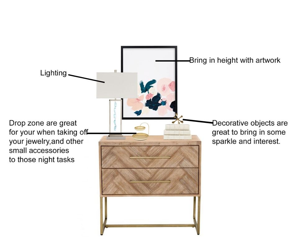
When decorating your room styling the top of furniture pieces like a night stand, console table and even your dresser are important and need to be addressed. Selecting just a few mindful pieces will bring that furniture piece from being boring into looking more put together. Design Steps: How to Style a Nightstand A nightstand may be small, but it plays a big role in your bedroom design. It should be both beautiful and functional — giving you a place for everyday essentials while also adding style and personality to your space. 1. Start with the Right Size Choose a nightstand that works with the height of your bed. Ideally, the top of your nightstand should be about the same height as your mattress, or just slightly higher. This makes it easier to reach for a lamp, book, or glass of water. 2. Add Lighting A table lamp or wall sconce is one of the most important pieces for a nightstand. It adds warmth, creates a cozy glow, and gives you practical lighting for reading or relaxing at night. 3. Keep Everyday Items Close Think about what you actually use before bed. This could be a book, reading glasses, lotion, lip balm, a small dish for jewelry, or a glass of water. Keep these items organized so the nightstand still feels clean and intentional. 4. Add Something Decorative Bring in one or two decorative accents to give your nightstand personality. A small vase, candle, framed photo, decorative box, or greenery can soften the look and make the space feel more styled. 5. Use a Tray or Bowl A small tray, bowl, or dish helps corral smaller items so they do not look cluttered. This is perfect for jewelry, watches, remotes, or nighttime essentials. 6. Create Height and Balance When styling your nightstand, mix different heights. For example, pair a taller lamp with a lower candle, stacked books, or a small decorative object. This helps the design feel layered and balanced. 7. Do Not Overcrowd It Less is more. A nightstand should feel peaceful, not cluttered. Leave a little empty space so it looks clean, calming, and easy to use. 8. Connect It to the Room Your nightstand should flow with the rest of your bedroom. Repeat colors, textures, or finishes already used in the room, such as wood tones, metal finishes, soft linens, or accent colors. This helps create a cohesive, designer-inspired look. A well-styled nightstand should feel practical, pretty, and peaceful — the perfect finishing touch to a beautifully designed bedroom. Shop the look I’ve rounded up some of my favorite decor items I wanted to share with you today. Click on the numbers by each word under the photos and it will go directly to site for your convenience. Note: These may contain affiliates links. I might receive a small commission if you purchase something. Don’t you worry there is no extra cost to you. This helps me keep this blog going. Disclosures & Privacy Policy Nightstand- 1/ 2/ 3/ 4/ 5 Lamps- 1/ 2/ 3/ 4/ 5 Wall Hanging- 1/ 2/ 3 / 4/ 5 Drop Zone- 1/ 2/ 3/ 4 Personal Touch- 1/ 2/ 3/ 4 / 5 Check out these other How to’s Blog post 6 Steps How to design your home How to Create a color Palette for your home Key Aesthetics for a Zen Bedroom Needing help with your home or help selecting the right products for your nightstand, let’s talk about your project! I collaborate with clients throughout the USA all online. By taking your inspiration, I will put together a cohesive design for your space that is tailored to you personal design style and lifestyle. I do all of this within your budget. Want to know more on how E-Design works? Let’s talk! e-design contact me
How to create a color palette for your home

Have you ever found yourself scrolling through Pinterest or Instagram, saving all those beautiful interiors you’re absolutely loving? You notice how every space looks so pulled together, layered, and intentional — and you think, “Wow, I wish my home could look like that.” Well, the good news is… it can. Creating a designer-inspired home is all about building a cohesive look that flows naturally from room to room. It’s not just about making one space, like your living room, look beautiful. The goal is to create a home that feels connected, balanced, and thoughtfully designed throughout. When your colors, textures, furniture styles, and décor choices work together, your entire home begins to feel more polished and complete — almost like you had a designer come in and pull it all together for you. Here are a few simple tips to help you create a more cohesive look throughout your home. Where do you find your color palette Create a color palette. You can get your color palette from: Your favorite color From inspirational pictures. Artwork or area rugs anything that you just need to have in your life structural elements that can’t move Example: kitchen cabinets, flooring and counter tops 1.Favorite colors Do you have a favorite color? Is it a color that would look great in the home? Your favorite color can be spread throughout your home. That would be your great POP of color. For Instance, my favorite color is Blue. I would use that color as my main pop color/ accents. I would add blue in the accent pillow, in the rug and accent pieces. 2.Overall feeling from Inspirational pictures Grab a few pictures from Pinterest and Instagram and create a board. Select anything that catches your eye. Take a look do you see the types of colors and styles you are drawn to? Inspiration pictures can help guide you with your color palette and how your overall style will be. 3. Artwork and Area Rugs Artwork and an area rugs are great ways in coming up with your color palette. Loving an art piece that is in your home or it might be in a store that you have been eyeing all this time? Take a look in the colors being used. Select 1-2 colors out of that piece. You don’t have to use all the colors in the piece just select a few. How to create your color palette 1. Select a neutral select 1 or 2 neutral colors. Neutrals for instance like gray, taupe, tan, brown, cream and black 2. Select a white The white or off white will help coordinate with the neutral colors. The white could be used on the trim, ceiling and doors. 3. Select your pop of color then add 1 shade lighter This is your overall color that will be seen throughout your home. How to use your color palette 1. Main color The neutral will be your main color and overall wall color. Use that main color in different ways throughout your home. This helps coordinates with the neutral. The white could be used on the trim, ceiling and doors. I suggest starting with a neutral sofa. For one main reason if you chose just say a “red sofa” because you liked how it looked at the time or you were following a trend. Then you started not liking this sofa? Will you replace it? If you don’t mind spending money then this would be fine. I suggest investing in a good neutral sofa. You want quality and durability. It’s more affordable to replace throw pillows, artwork and area rugs then keep replacing a sofa. Also, choosing a neutral sofa is easier to coordinate the colors throughout the home. Down the road you have decided that you wanted a change. You already have a neutral canvas already to work with from your neutral sofa and walls. 2. Pop of color The color would be seen on accent walls on pillows and accent chairs. The shade lighter will give you depth . Tip: Colors should be repeated 3 times in the room to help create the cohesive look. 3. Select an accent color The accent color would be the main pop colors complementary color and/or shade lighter of that color. This color will compliment the main color. Inspiration Photo Let’s look at an example. What’s the color palette in this picture? The neutral is white, and black. The pop of color is blue and green and the accent is gold. You will then use these colors throughout your home. Needing help with your home, let’s talk about your project! I collaborate with clients in the throughout the USA all online. By taking your inspiration, I put together a cohesive design for your space that is tailored to you personal design style. I do all of this within your budget. LET’S COLLABORATE Color palette inspiration boards