Hey Everyone! Welcome to my blog! I’m Andrea, I’m a mom of 2 lovely girls and an Interior Designer. On my blogs I like to give helpful design tips, design inspirations and DIY and my recent projects.
I wanted to share something with you today a design mistake I see quite often and have been asked about all the time when I enter into a space. Here are few great tips on this. So, when you are designing your lovely homes you will keep in mind these design rules that designers use all the time when designing their clients space.
The one main mistake I see is “Scale and proportion”
When I enter into a room I’ve noticed wall hanging are to small for the wall and/or hung to high, Rugs that are to small, and furniture is either to big or to small for the space and accessories are just random things all over the place.
Tip #1- Correct wall hanging
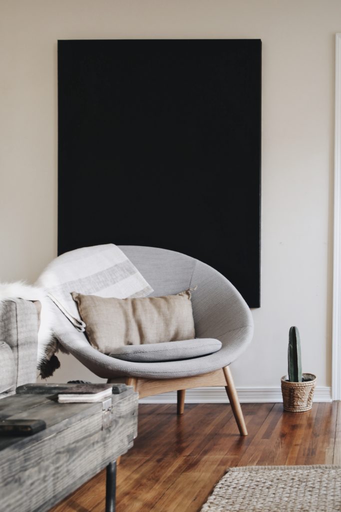
I have seen many times in a room the picture is so small for a large wall. It is just floating there. All by itself. When hanging a picture or mirror it should be a approx. 57″ high from floor to center of picture. Eye level is about 5 feet. If the picture is going above a sofa or piece of furniture it should be about 8-10″ from the back of that sofa. Don’t let it be almost touching the ceiling. 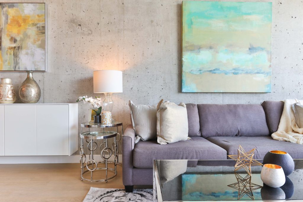
Tip#2- Don’t go to small.
This goes for pictures on walls and area rugs. When selecting wall art most cases go for the bigger picture. It should fill about 75% of the wall space. For example, if the sofa is 84″ wide your picture should be about 63″ – 65″ wide.
Don’t see a picture you like and want to create something more personal. Creating a wall gallery with all your kids artwork would be awesome. Your kids would feel so special seeing their masterpiece on the wall. 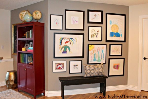
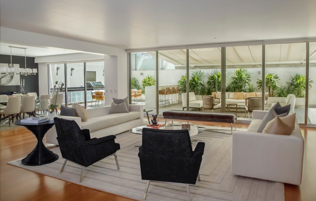
For area rugs also go for the larger rug. Your furniture should be anchored to that rug not floating in the room. Each leg should touch the rug. A larger rug would look nicer, and it will give a more grander feel and warmth in the space.
Check out my last blog about picking the right rug size. CLICK HERE
Tip #3- Measure
Before you go on buying furniture. Have a plan. Measure the space. Ask yourself What is the right size sofa I should get before going to the furniture store. It might look like a good size sofa in the store, but remember, that sofa is in a huge furniture store. They have the space for that sofa, but you might not. It would really suck when you buy the sofa and then got home and it doesn’t fit. It is to big. the sofa is in the way of the walking space or It can’t fit through the door to be in that space. ( Make sure you know how you will bring this sofa into the space. So measure the door opening). Some stores will take the sofa back for a restocking fee. You can try fighting that, but you might not win on this. I’m sorry. So Please make sure on the size first. Again have a plan. Create a quick floor plan with the furniture sizes on it and then you can reference off that.
If you are still not sure what would fit or what is the best furniture layout for your space. I have a Great and quick E-design service just for you. It’s called Floor plan Layout. You provide me with the measurements and a few pictures of the space so I know what I am working with. Then I will send back to you a furniture layout that works best in your space with all the measurements for the furniture. You take that to the store. It takes the guess work out when shopping on what is the right size. Would this fit type questions.Check it out! CLICK HERE
Tip #4- Accessorizing
When accessorizing keep in mind of the scale and placement. Here are a few key rules. The space should look balance. Have a combination of small, medium and large objects. Start with a center piece (like a mirror or artwork). Then add a large piece or 2 on each side to give some height and balance ( like a lamp and vases) and then add filler pieces. (Like what I show here in the rendering) Large examples like: large vases, lamps or a plant. Then work your way down with a picture or smaller vase and then put in some filler pieces. You can add books or a box if you don’t have medium size objects and you need some height in some areas.
Quick Tip:Group objects together and work with odd number of objects. It works best. Also, less is more. Overcrowding a table top just looks like a mess than collecting a few items and displaying some personal items that mean a great deal to you. 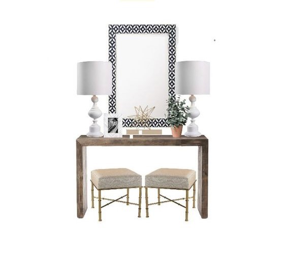
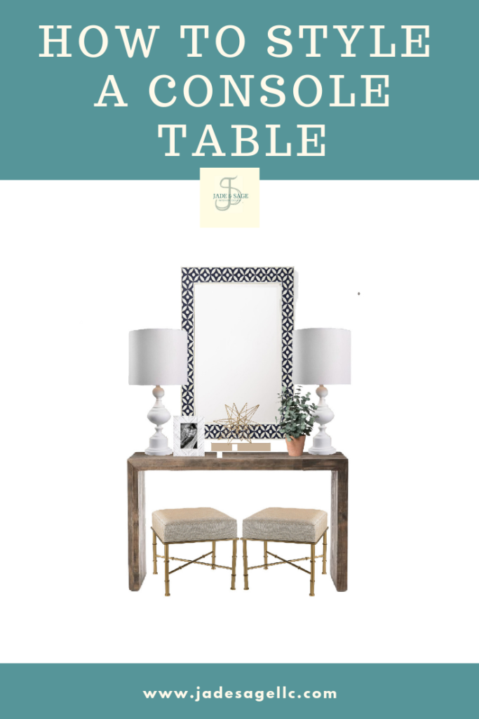
Want to know more about How to style a console table check out my blog here
I hope this helps and get you started in the right direction in decorating your home.
If you do need some assistance check out my E-Design services. I offer services like Designer on Call and Refresh E-Design that would be great for just that. Let’s collaborate on your next design project. CHECK IT OUT HERE
if you live locally you can ask me about my service “Designer for a day”.
Want to keep in touch and GEt more design tips? Sign up for my newsletter. When signing up,you will receive my free e-book called a de-cluttered life.
Click here for your Free E-Book
HAPPY STYLING!

