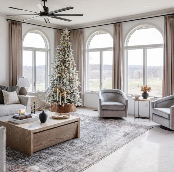
DO: Hang Curtains High and Wide

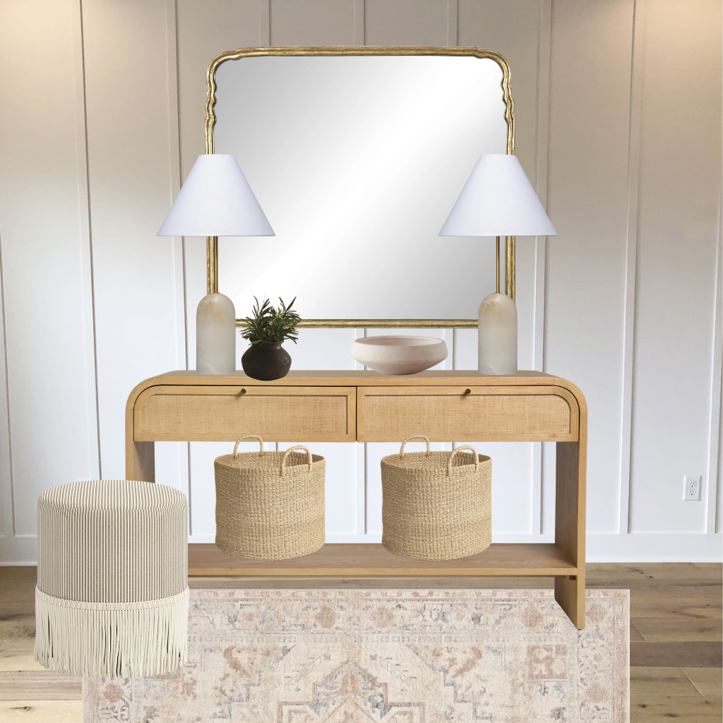
DO: Choose Natural Textures
Linen
Cotton
Woven wood
Bamboo
Soft, muted neutrals

DON’T: Overmatch Everything
Avoid:
Matching curtains to wall color exactly
Matching sofa fabric exactly
Heavy shiny polyester in a rustic room
Window treatments should layer, not disappear.
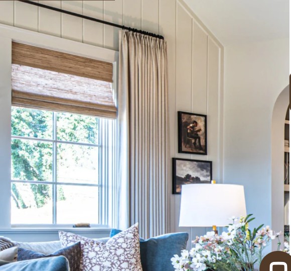
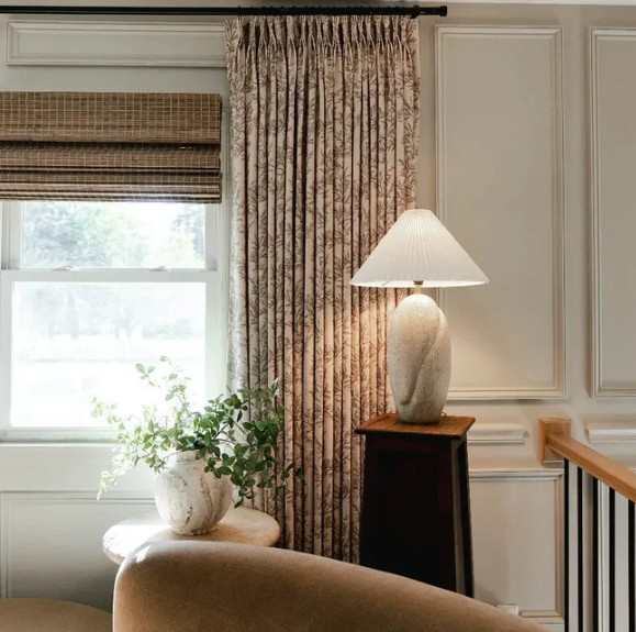
DO: Layer for Depth
Beautiful combinations:
Sheer + linen panel
Roman shade + drapes
Bamboo shade + neutral curtains
Layering = richness.

Ask:
Is this for privacy?
Light filtering?
Blackout for bedroom?
Purely decorative?
Design must serve purpose first — beauty second.

 Bonus Designer Tips (Advanced)
Since you’re a designer, let’s go a little deeper:
If ceilings are low → use vertical stripe texture
If windows are small → go wide with panels
If room feels cold → use warmer natural fibers
If room feels heavy → choose lighter weave fabric
Hardware matters — aged brass, matte black, oil-rubbed bronze > cheap chrome
thanks for joining in.
Stay Tuned for Next Design Tip.
Ever needing help with Designing and would love some help putting your room together? Or you have a design question. Check out a my E-Design service The Refresh
Get a copy of my De-Clutter your Home E-Book. Sharing tips and tricks on how to organize. HERE